Peter Few

BSc in Biological Science and 8 years of experience working with data
I want to further develop my data skills and will be displaying my projects here
View My LinkedIn Profile
Create a Power BI Dashboard Displaying Waiting Times for Cancer Patients
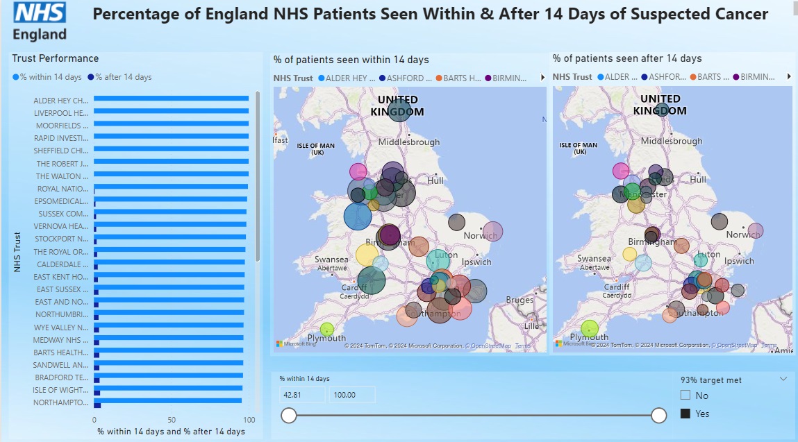
Project description: For this project, I was interested in creating a dashboard that would display the waiting times for NHS patients within England who were suspected of developing cancer. The NHS has a target that 93% of urgent suspected cancer patients should be seen within 14 days, so I designed my dashboard to highlight which trusts were missing and which were meeting the target. I found a data set on the official NHS website at: https://www.england.nhs.uk/statistics/statistical-work-areas/cancer-waiting-times/monthly-prov-cwt/2021-22-monthly-provider-cancer-waiting-times-statistics/provider-based-cancer-waiting-times-for-march-2021-22-provisional (2. Two Week Wait – All Cancers (Provider Data)).
1. Prepping the Data
I needed to clean and format the data before putting it into PowerBI. First I removed the data from columns I to N, as it was either repeated data, empty, or was not relevant to my dashboard. I also removed column D as they were all the same type (suspected cancer). I wanted the data to display on a map visualisation, but the dataset only contained the NHS trust name with no address. I added a new column and used the https://www.nhs.uk website to find the postcode and county for each NHS trust. I needed to calculate the patients seen before and after 14 days as a percentage to create a new column and fill in the gaps in the dataset. I used the formula =[@[after 14 days]]/[@total]100 & =[@[within 14 days]]/[@total]100 and then set the data type as a percentage in Excel and later also in PowerBI. I wanted there to be a slicer to highlight the trusts above and below the 93% target. I added another column named 93% target met and used the formula =IF([@[% within 14 days ]]>=93,”Yes”,”No”) to populate it.
2. Creating the Dashboard in Power BI
Once I loaded the data into Power BI, I began by adding a light blue background to match the branding of the NHS. I decided that two maps were needed to visualise the data, one for % within and one for % after 14 days. I also added a vertical bar chart, so that the underperforming trusts could be easily highlighted. I set the background for all charts and slicers to white with 80% transparency. This formatting made the charts pop out from the background slightly without interfering with the overall colour theme of the dashboard. I kept a light blue formatting for everything and added an NHS trust logo so that it matched the branding used by the NHS. In a real-world situation, this dashboard would provide users with easy-to-access and visible data to determine which trusts were meeting and which were failing the 14-day target.
Finished Dashboard